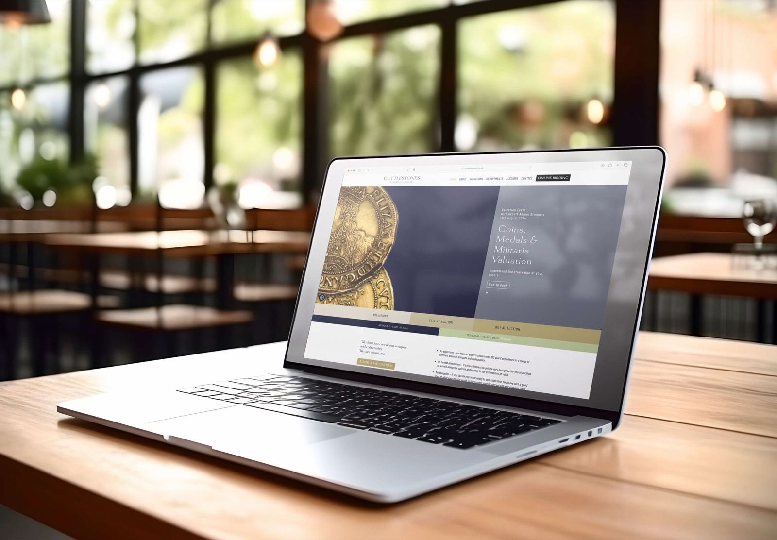
Website design - the new navy and gold identity in application.
A full brand strategy and identity rebrand that attracted higher-value clients, increased consignments, and unified the brand across every platform - from signage to social media.
The situation
Cuttlestones had a strong reputation as a modern, forward-thinking auction house - but their brand wasn't keeping pace. They needed to attract a higher-value clientele and expand their global reach.
Scope of work
Brand Strategy
Logo & Identity
Brand Guidelines
Website Design
Signage
Digital & Press Ads
Merchandise
The story
We’d worked with Cuttlestones on design elements for several years, so we knew the business well. But the time had come for a proper strategic overhaul - not just a visual refresh. We ran discovery sessions and brand workshops with key staff and marketing associates to build a strategy from the inside out.
The new identity - bold navy and gold, elegant but approachable - was designed specifically to appeal to clients with higher-value items to sell. Everything from the website to the lot labels was built on the strategic foundation we developed together.
More from this project
Through insightful workshops and strategic sessions, Revive developed a fresh brand identity, including a sophisticated new logo and a cohesive visual identity that perfectly aligns with our vision. We've seen increased client engagement and higher-value items consigned for auction - all thanks to the rebrand.
Ben Gamble Managing Director, Cuttlestones
Professional Services
DJH Accountancy & Business Advisory Group
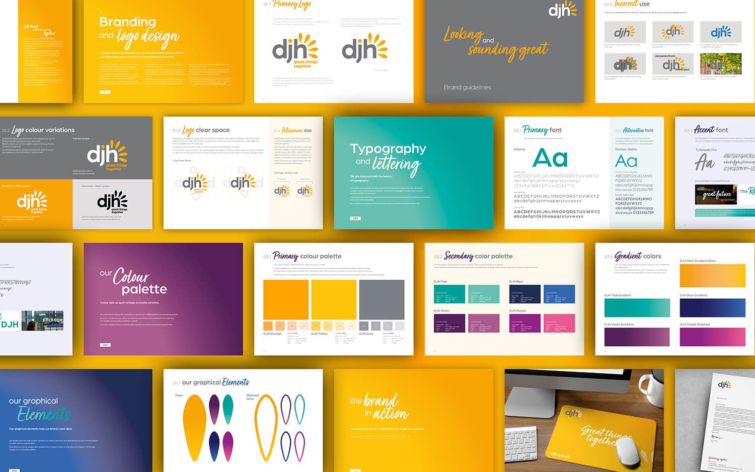
Brand guidelines - the full system, from logo rules to colour and type.
A complete brand evolution - new logo, stationery, guidelines, signage, and merchandise - delivered in 8 weeks to coincide with active acquisitions, without losing a decade of built brand recognition.
The situation
Following nine acquisitions and expansion to 12 offices, DJH needed to simplify their name and modernise their identity - without losing the brand equity built over years of growth. The deadline was immovable: 8 weeks.
Scope of work
Logo Evolution
Brand Guidelines
Stationery Suite
Signage
Merchandise
Recruitment Brochure
The story
Revive had been working with DJH for ten years when this brief came in - through their growth from 60 to approximately 500 team members. That relationship was the project’s biggest asset.
The brief was evolution, not revolution. The new logo retained the colours and strapline that carried brand recognition, while modernising the design to fit a business of DJH’s current scale. The brand launched internally via a company-wide Teams broadcast - showing the full rollout across signage, screens, stationery, and merchandise before anything went public.
More from this project
We needed a full brand transition in eight weeks, in the middle of an active acquisition programme, with a decade of recognition to protect. Damian delivered - on brief, on budget, and without a single conversation about scope creep.
Hayley Plimley Director of Marketing & Communications, DJH
Tourism & Leisure
PLAY@ Lower Drayton Farm
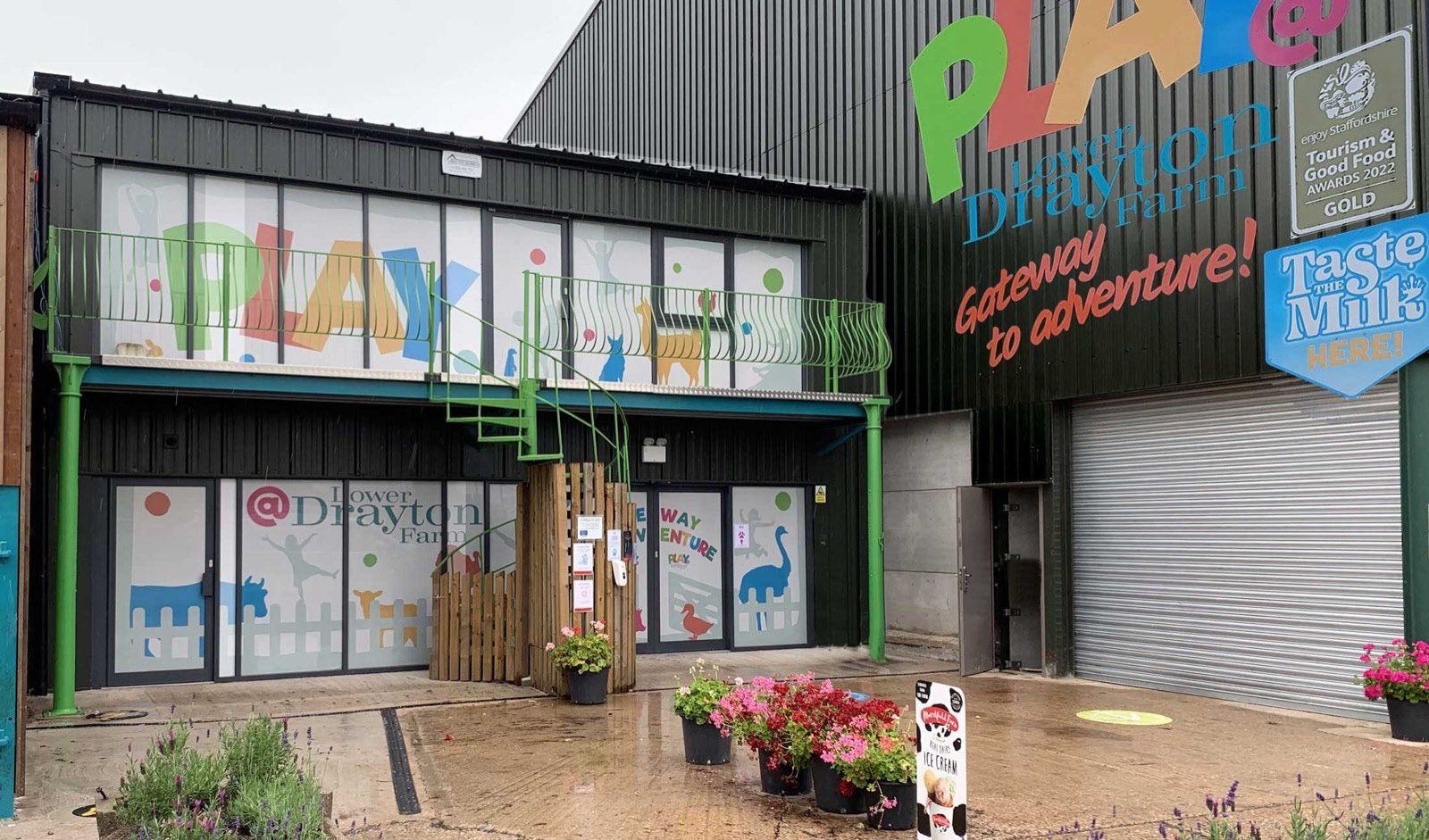
External signage - built to be read at motorway distance.
A bold, distinctive brand identity that helped launch what became a multi award-winning family attraction - visible from the motorway, consistent across everything from leaflets to a combine harvester.
The situation
A family farm with big ambitions - a massive new indoor play area, café, shop, and outdoor zones. They needed a brand as bold as their plans, built to cut through on a busy roadside and appeal directly to families.
Scope of work
Logo System
Brand Identity
Signage
Website Design
Digital & Print
Branded Machinery
The story
Lower Drayton Farm came to us with a clear vision - big, bold, and fun. We developed the PLAY@ logo alongside the Lower Drayton Farm and STAY@ logos as a cohesive family, each with its own character but working together as a unified system.
The brand needed to work at scale - roadside signage visible from the motorway - and at detail - leaflets, ads, and branded collateral. It also needed to be distinctive enough to stand out against anything else families might see advertised. The result was an identity that’s still going strong years after launch.
More from this project
Damian came up with a vibrant, playful brand which perfectly reflects the experience families will have. The supporting collateral and well set out brand guidelines have enabled us to retain strong brand identity throughout - he has designed everything from leaflets and adverts to the unique wrap design for our combine harvester!
Richard Bower PLAY@ Lower Drayton Farm
Professional Services
Capital Allowance Review Service
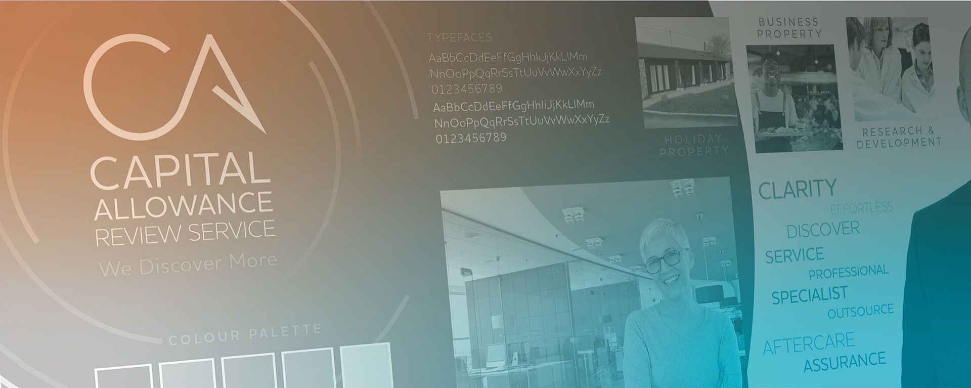
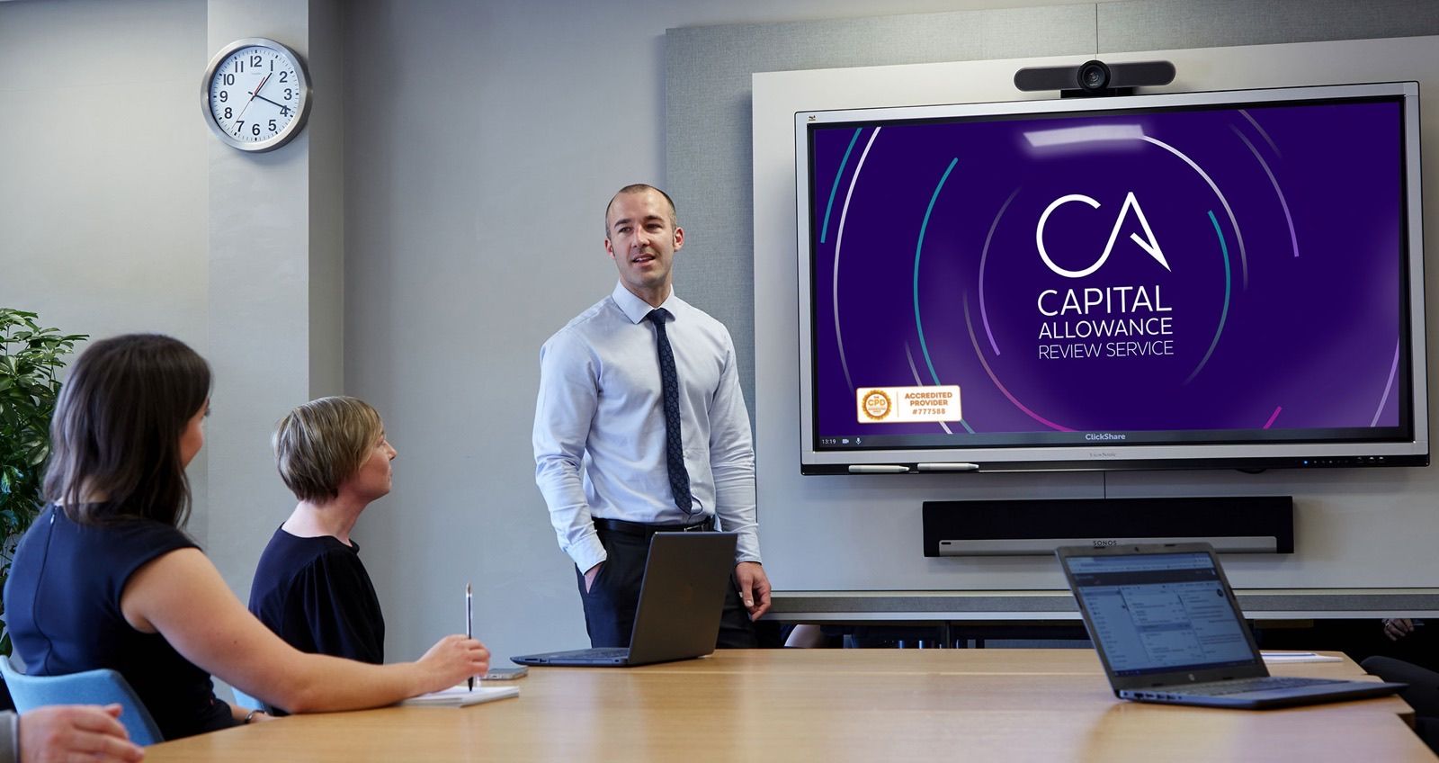
The CARS identity in application.
A new brand identity positioned CARS as the premier capital allowance review service in their market - generating strong positive feedback on launch and supporting continued growth in brand awareness.
The situation
An upturn in clients and a move to larger premises made the timing right. CARS needed a brand that matched their growth ambitions and positioned them as a premium, established provider in a specialist field.
Scope of work
Logo
Tagline
Brand Identity
Digital Assets
Print Materials
Brochure
The story
We started with discovery - working with the marketing team to establish the ideal client profile and market position. Using stylescapes, we showed how the brand elements worked together before committing to design.
The previous tagline had the right instinct but was too long to be memorable. We simplified it to a single line that captures the firm’s USP and echoes the sharp, targeted approach of the new logo design.
More from this project
Damian really listened to our needs and created a sleek modern feel to our new branding. We have had lots of positive comments since we launched our new look and this has really helped us to continue to grow our brand awareness.
Chris Roberts Managing Director, CARS
Your business could be the next one here.
If you're ready to build a brand that does real commercial work, let's start with a conversation.